Kati Kati Blend
Packaging Design + Analog and Digital Design
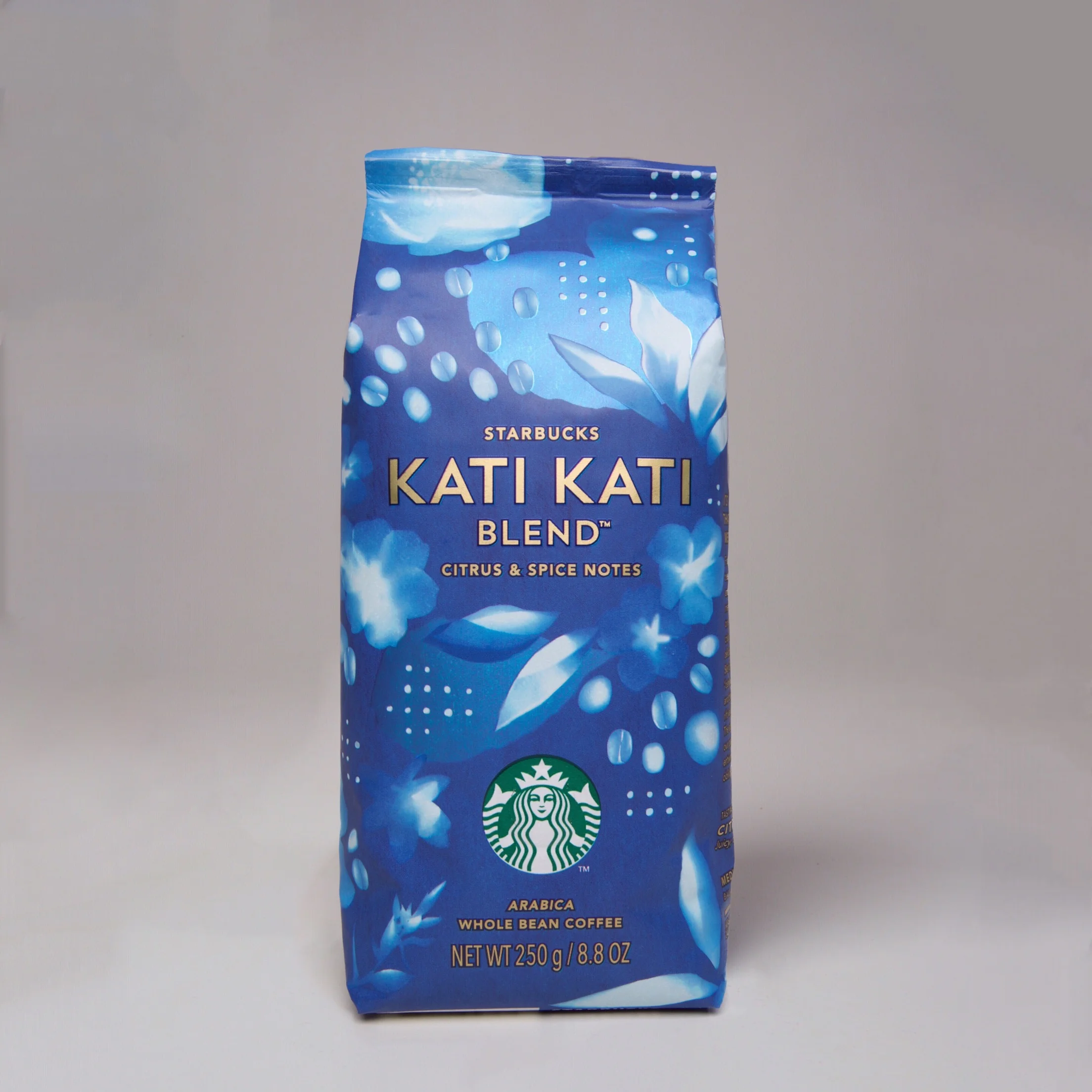
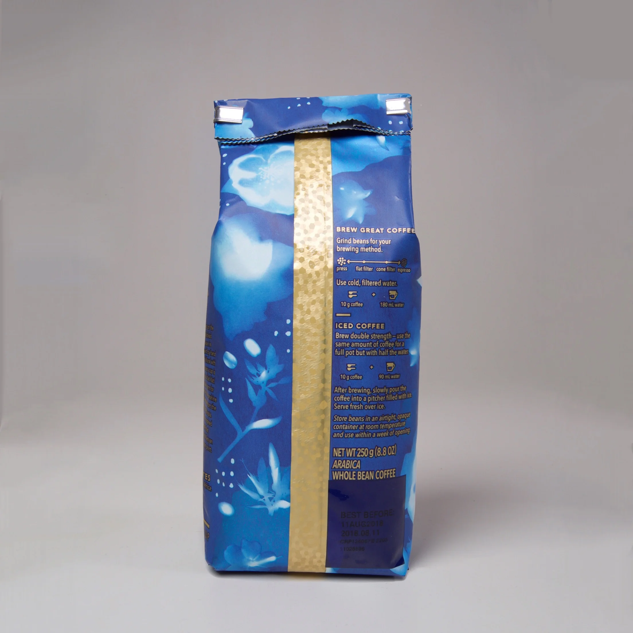
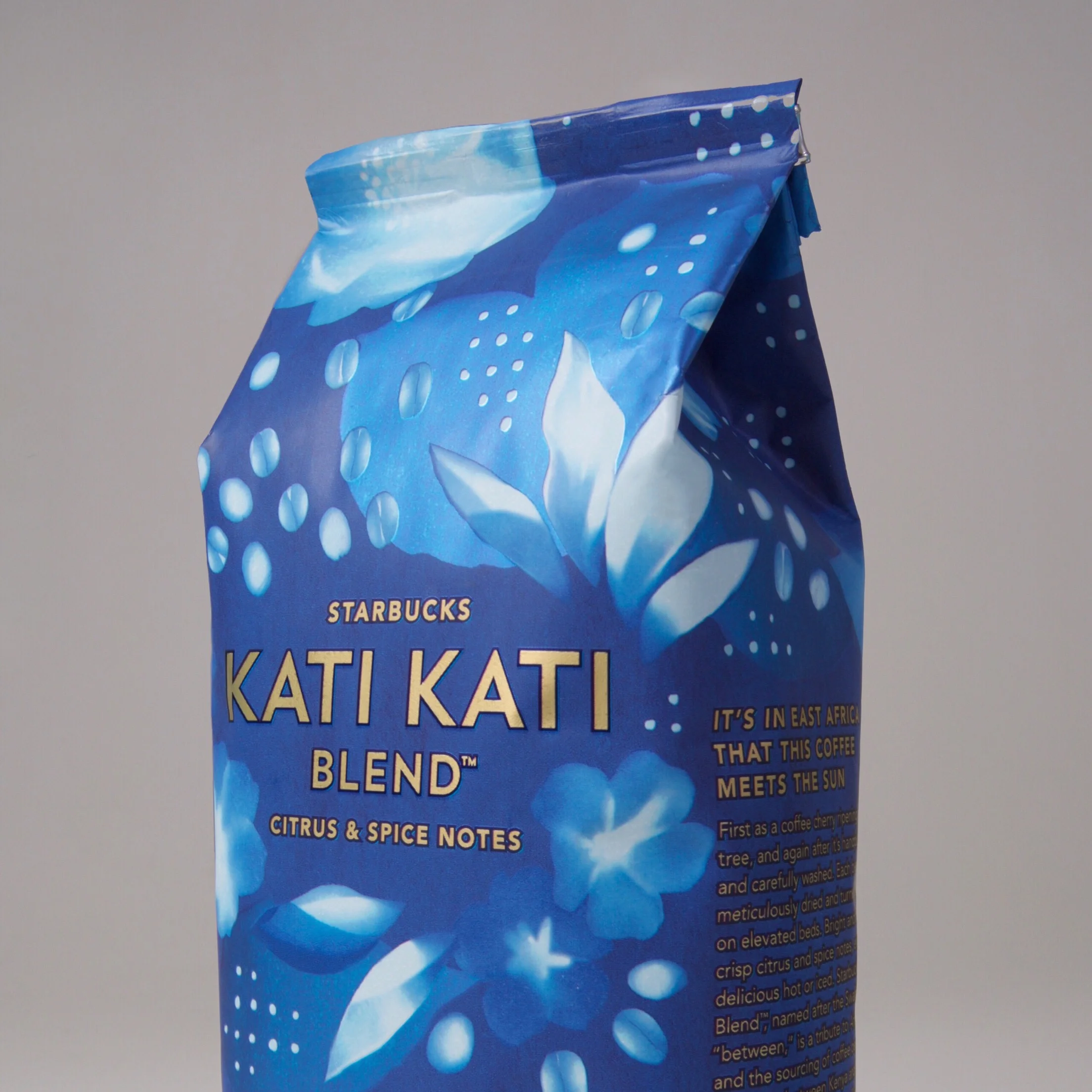
Kati Kati, named after the Swahili term for “between”, is a blend of beans from the rift valley between Kenya and Ethiopia. This year’s Starbucks Kati Kati Blend design is a tribute to African sunshine, and its impact on the blend.
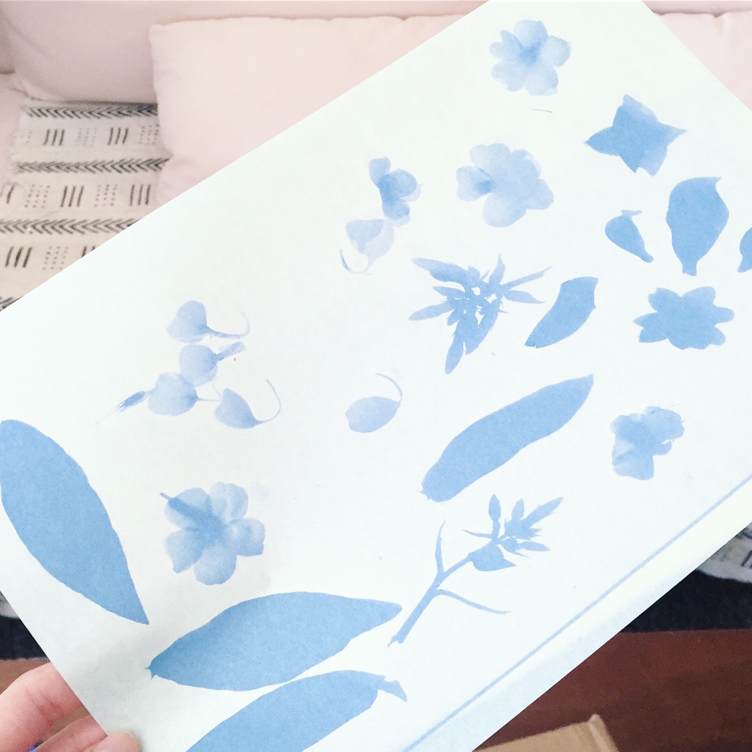
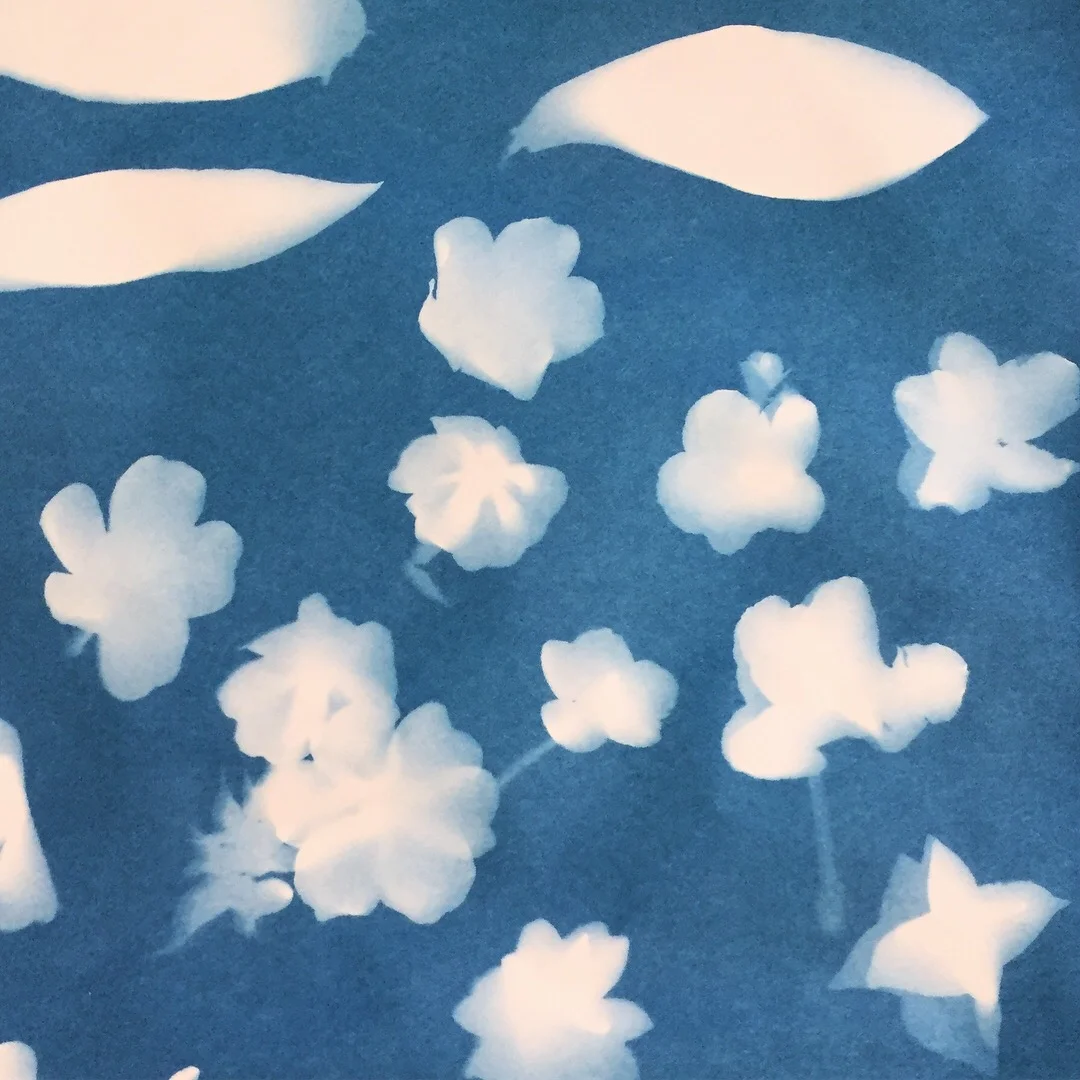
The sun played a leading role in the creation of the artwork. Using photo sensitive paper, coffee leaves, beans and flowers were arranged and exposed in the sun. The exposed images were then washed and hung to dry. This method was a way to echo the meticulous journey of the blend’s coffee beans (which are first handpicked, then carefully washed, and turned by hand to dry in the sun).
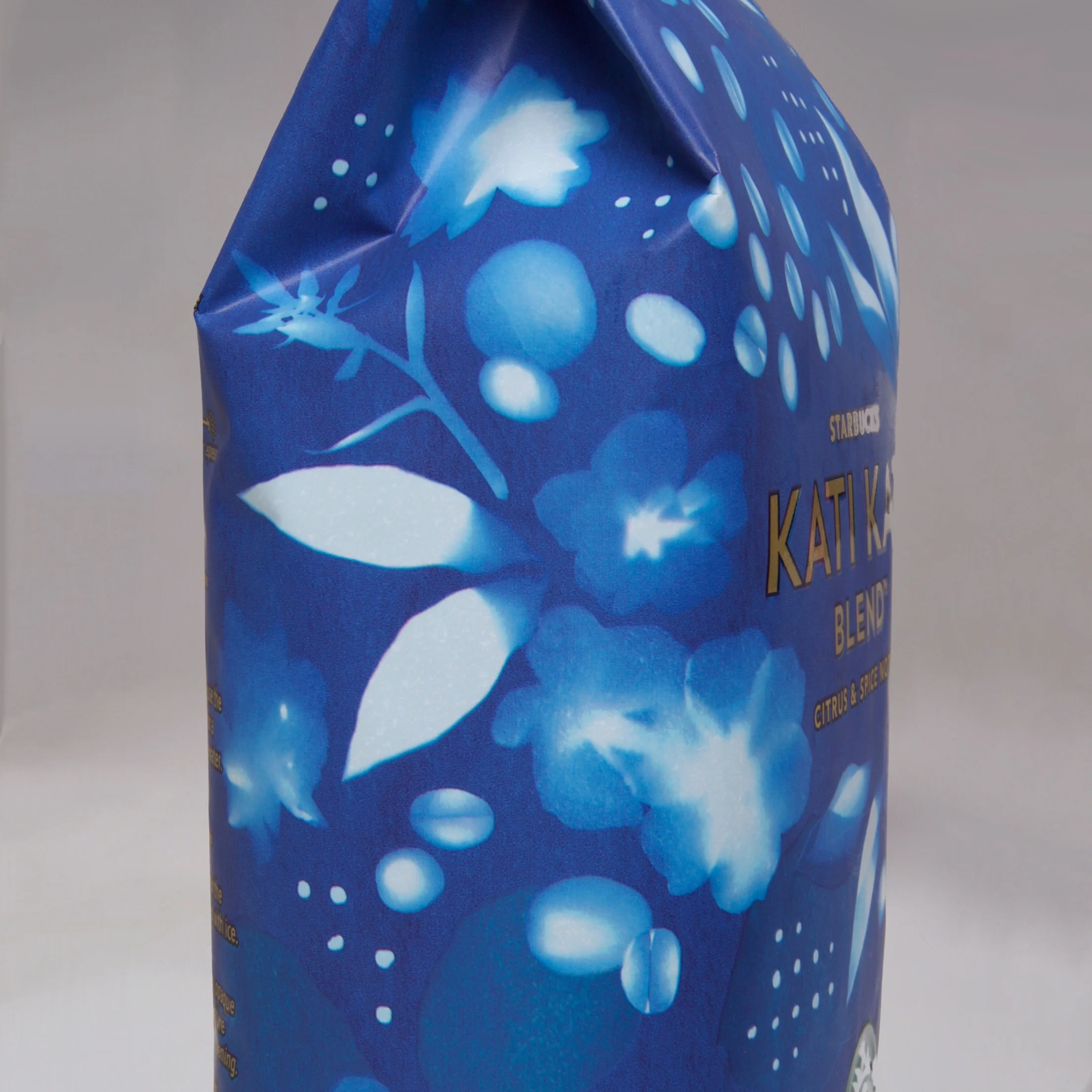
The result is a sun print that intertwines lush Ethiopian roses and Kenyan oblique sorrels with Starbucks’ beloved Arabica coffee leaves and beans. The deep blue and dotted patterns are also a nod to African indigo printed textiles. Finally, the glittery, gold seal on the back was inspired by the dazzling appearances of both Kenyan gold and Ethiopian opals.
Kopelani Blend
Packaging Design + Illustration
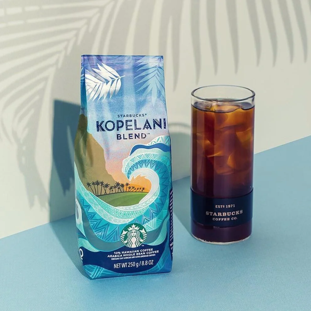
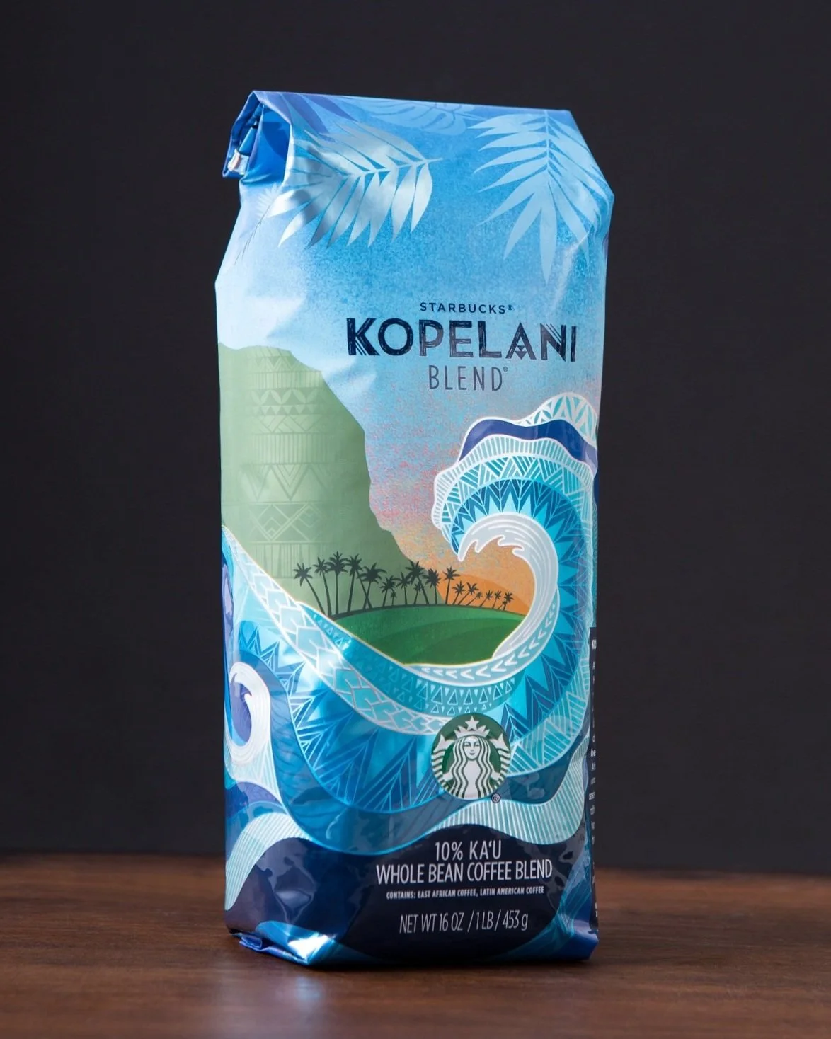
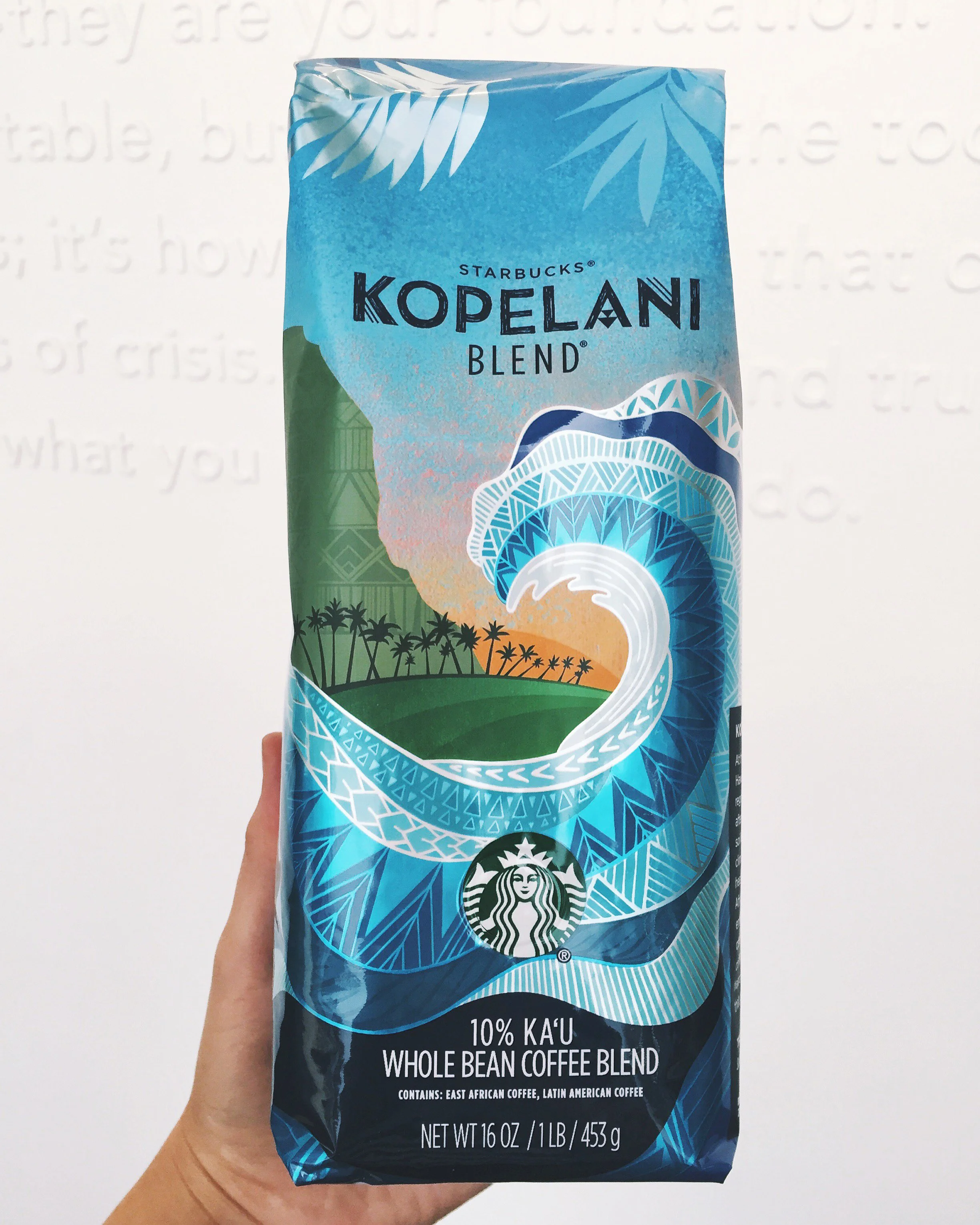
The design for Starbucks Kopelani Blend was inspired by Hawaii’s iconic ocean waves and the dramatic cliffs found in the Big Island’s Ka‘u region. The illustrated patterns are based on traditional Polynesian and Latin American patterns to honor the regions where the beans were sourced.
Some fun facts:
1. This was my first ever Starbucks coffee bag design.
2. The wrap-around wave design is seamless.
3. When it was first released in the summer of 2016, Kopelani Blend broke the record for the most partner markouts in Starbucks history.
4. It was featured on The Dieline.
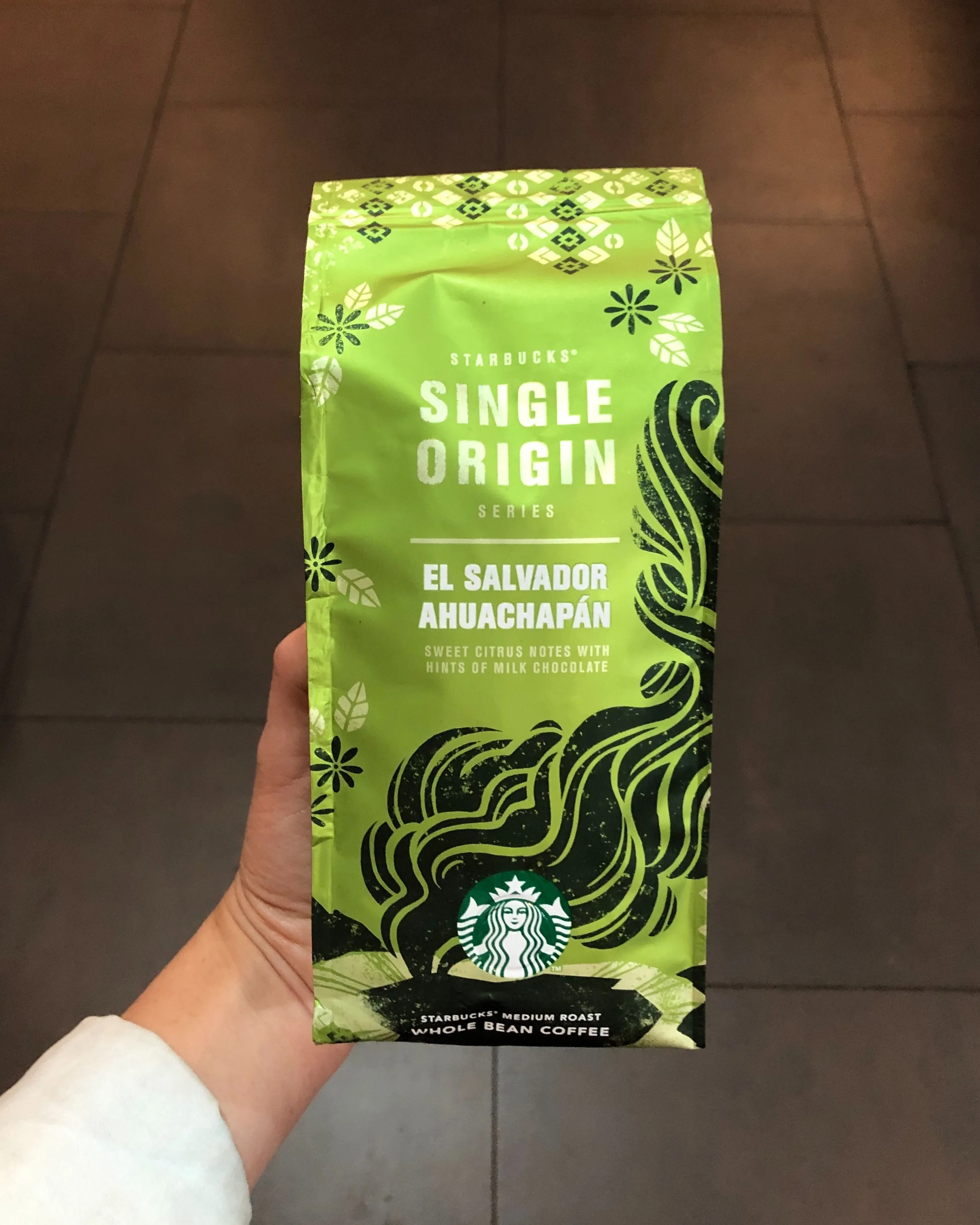
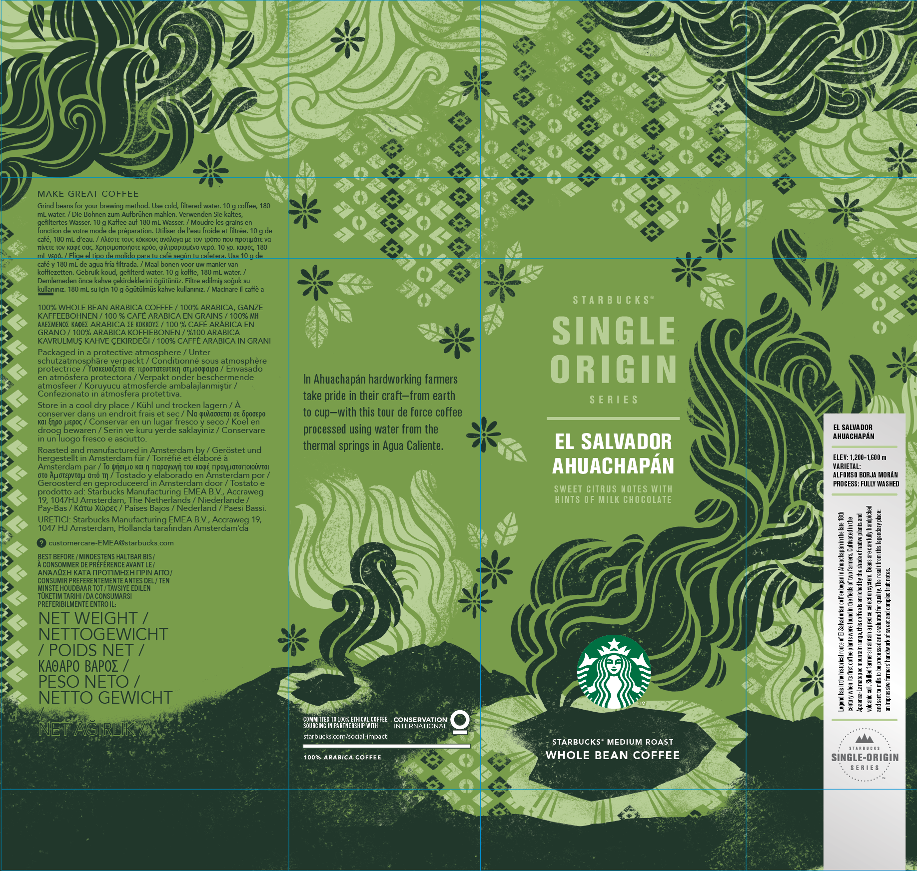
Single-Origin El Salvador Ahuachapán
Packaging Design + Illustration
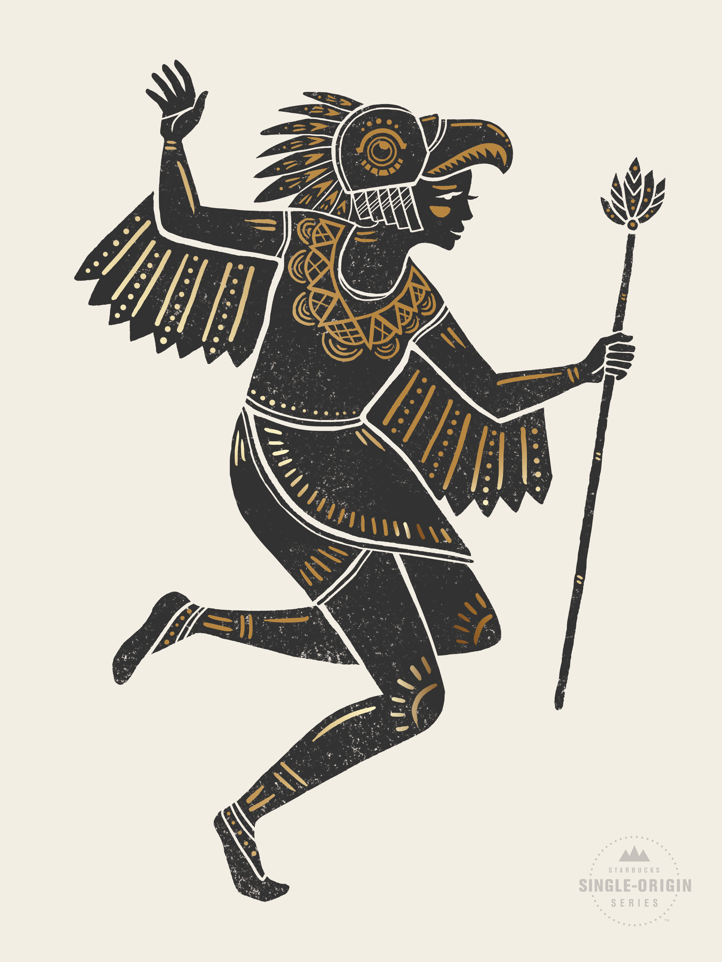
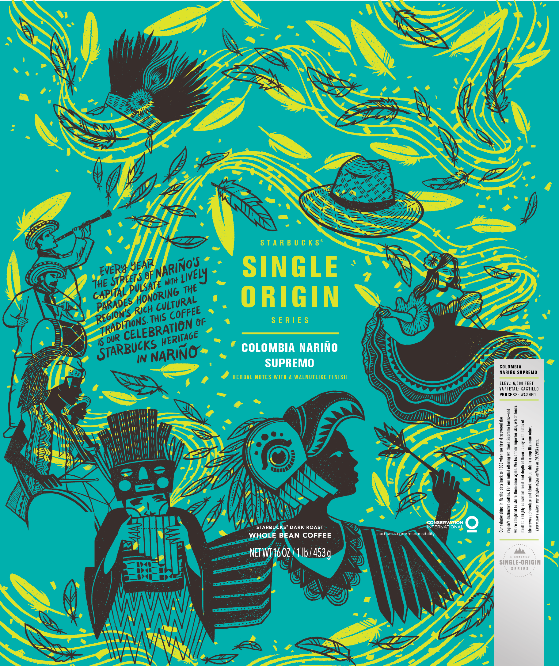
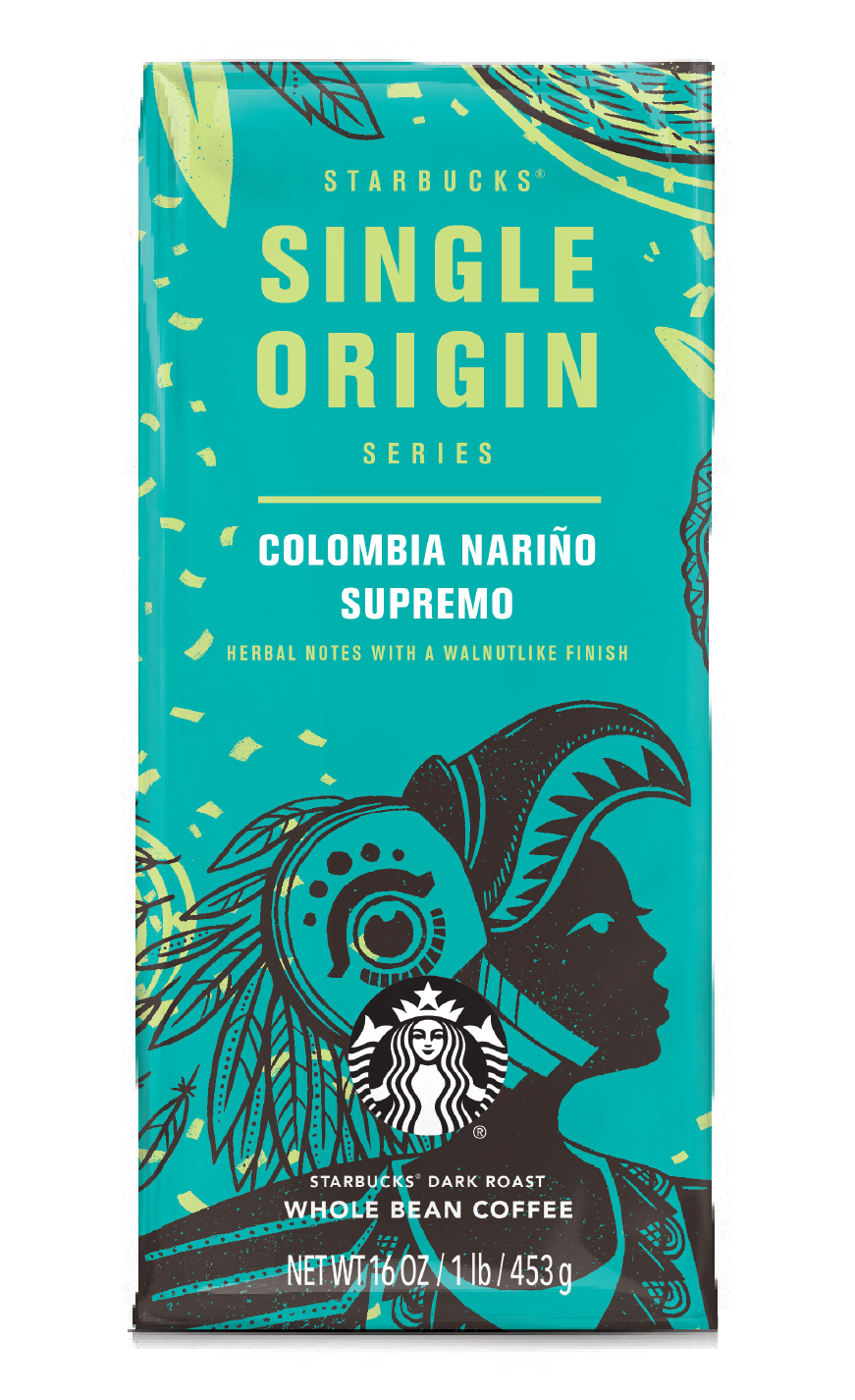
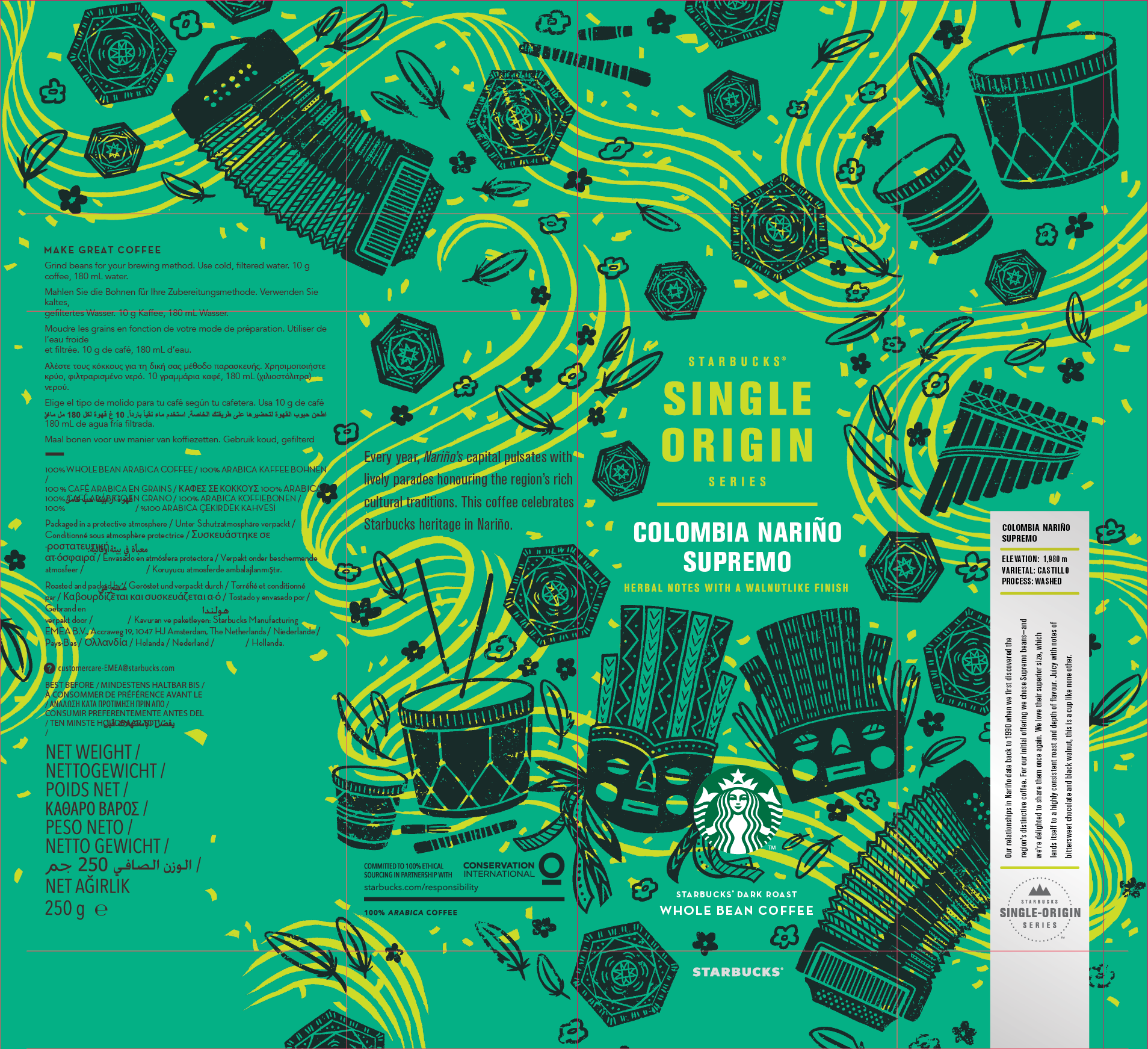
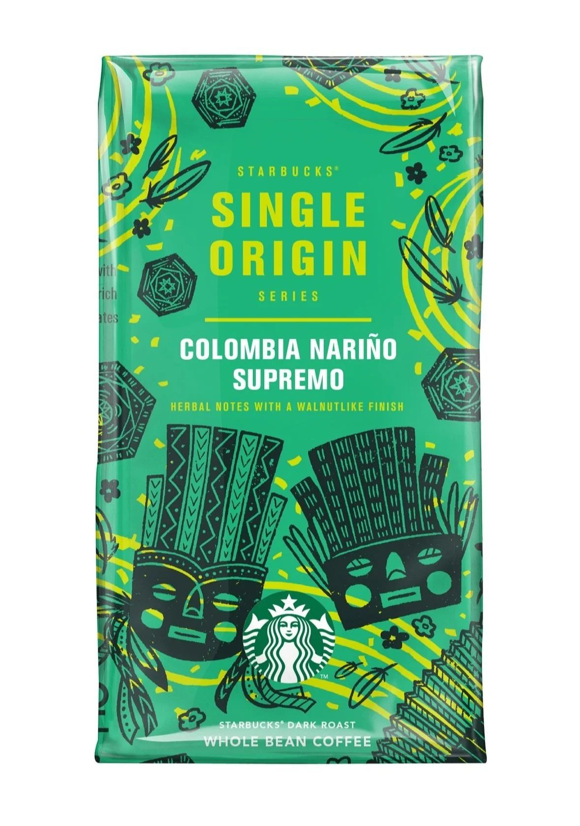
Single-Origin El Colombia Nariño
Poster Design + Packaging Design + Illustration
U.S. Edition of bag
EMEA (Europe/Middle East) Edition of bag.
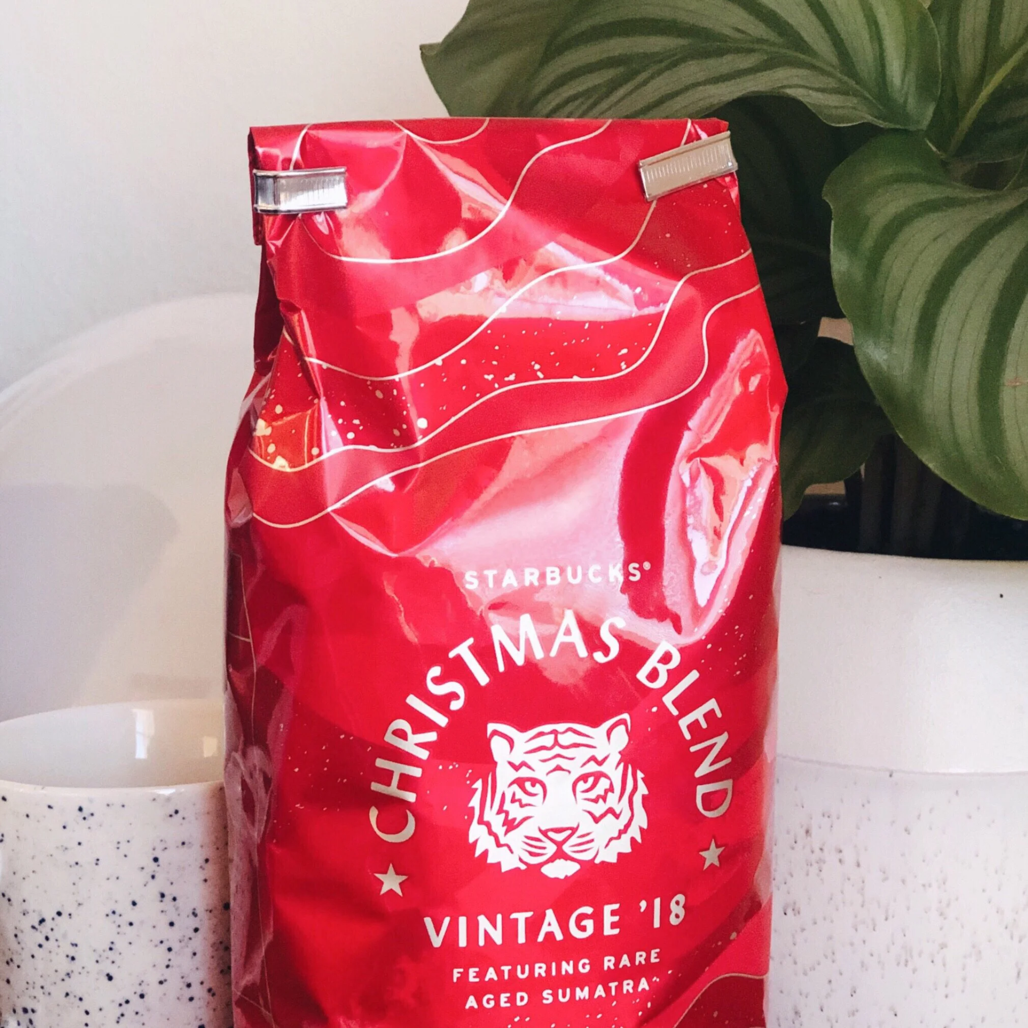
Christmas Blend Badge
Tiger Badge Design made in collaboration with Vivian Che.
