Inspiration
Feminist Protest Imagery
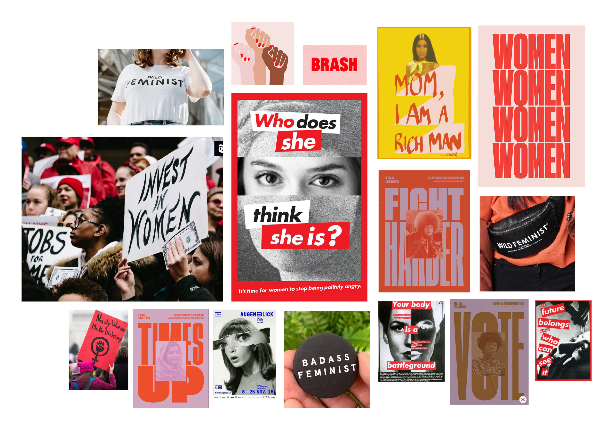
The visual language for Her First $100K rebrand is inspired by feminism first and finance second. I started by gathering contemporary expressions of Women’s Empowerment, until honing in on feminist protest poster imagery and the iconic works of Barbara Kruger.
Finance From Tori Dunlap
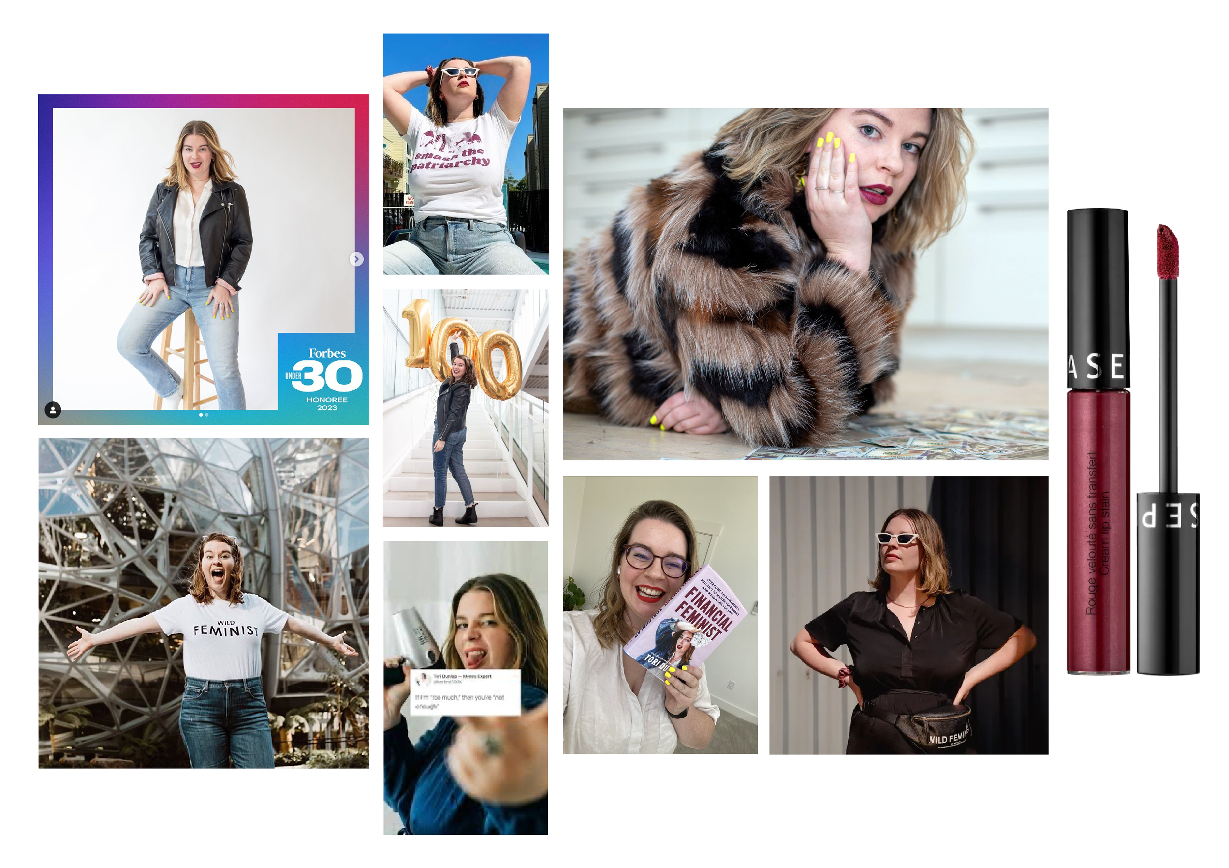
As founder and CEO, Tori Dunlap is the heart of the Her First $100K brand. So, the rebrand is meant to communicate Tori’s radically empowering approach to finance and serve to amplify her vibrant personality.
Logo Development
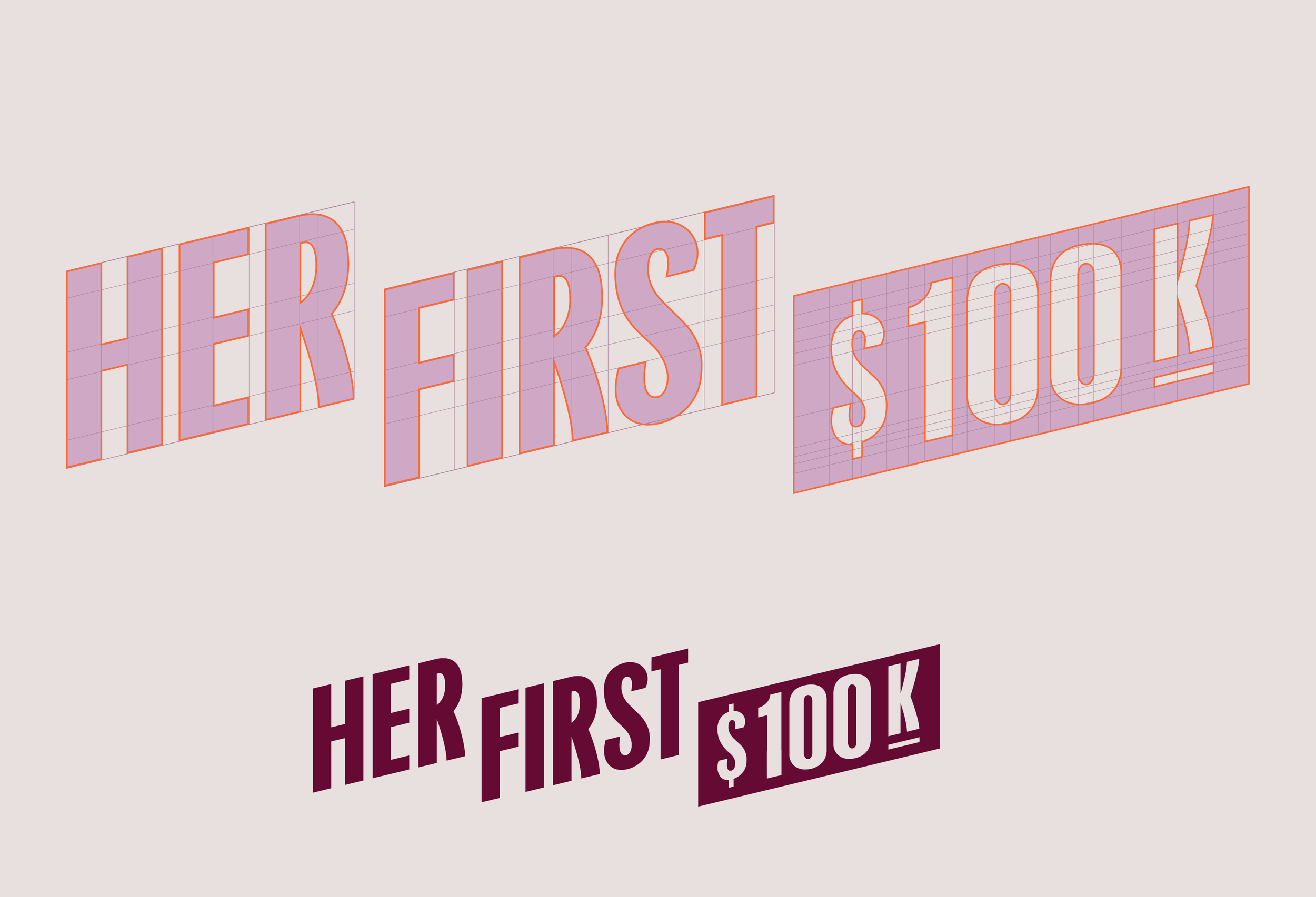
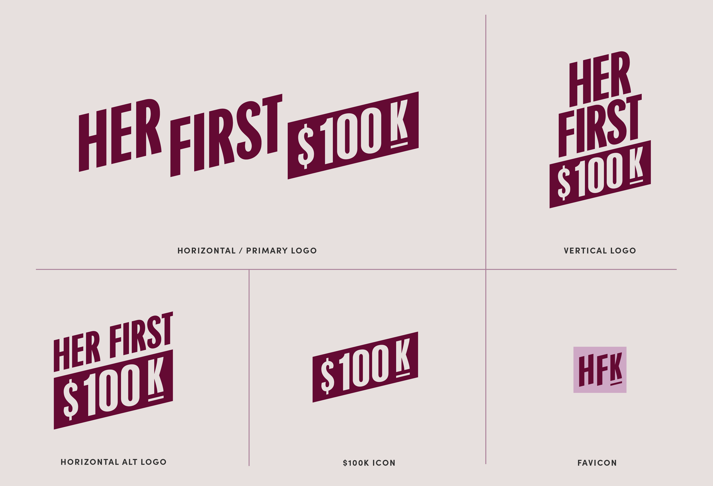
The new Her First $100K logo is a custom-built wordmark. Each letterform was thoughtfully constructed with angles and curves that correspond to communicate forward movement, upward fiscal growth and most importantly — feminine strength.
Typography
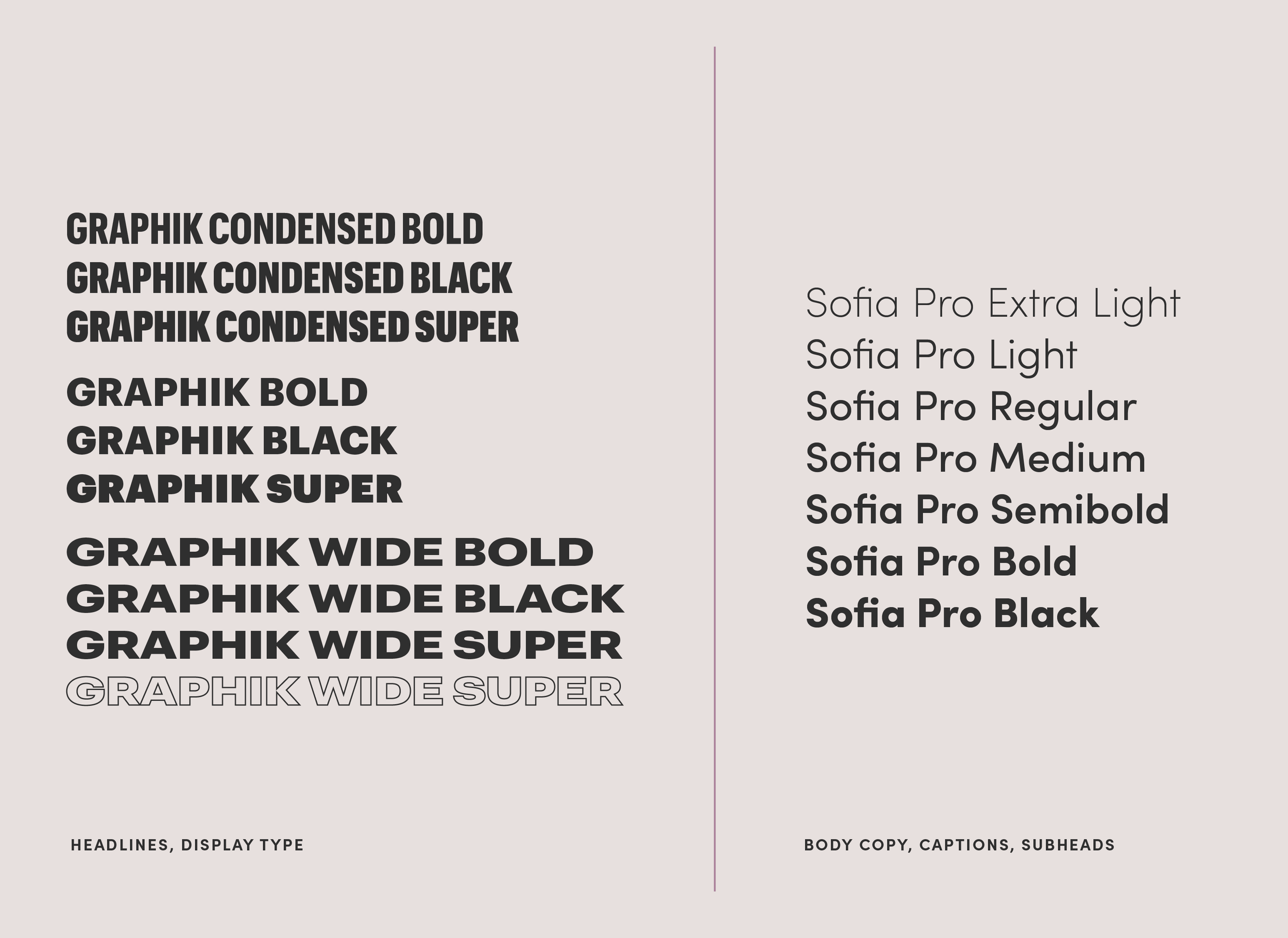
Typography suite led by Geena Sisomphou.
Color
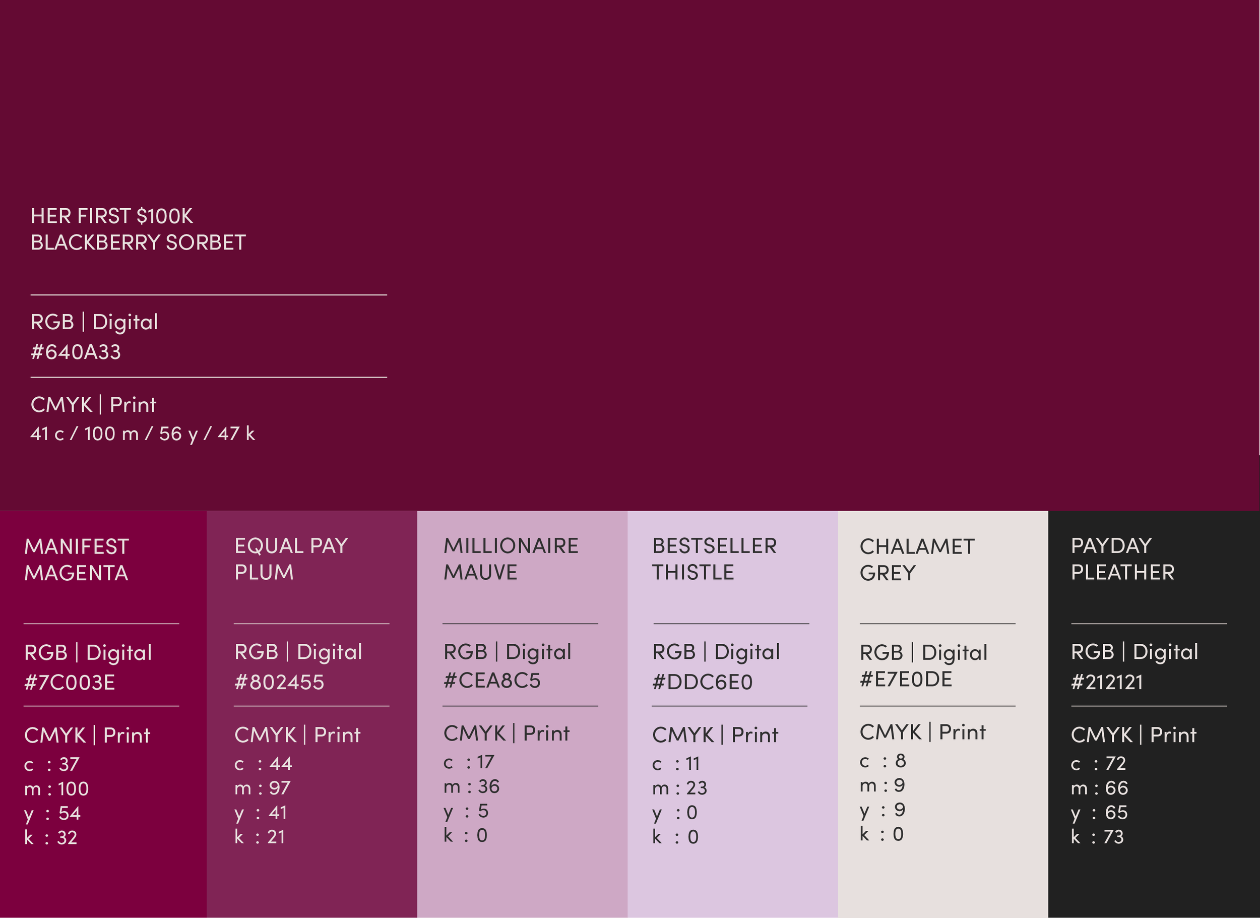
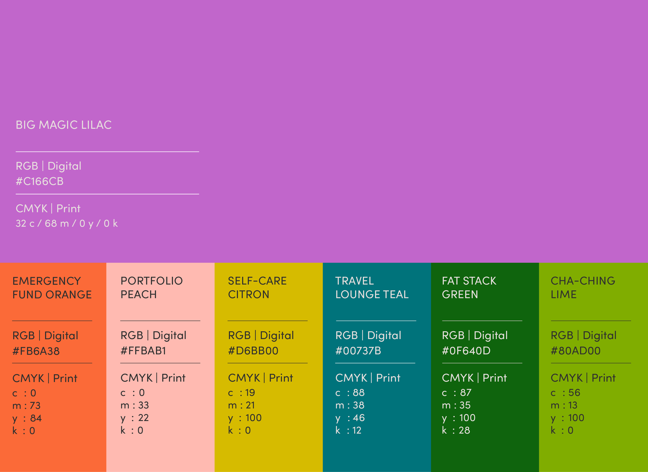
The primary palette works in support of the primary brand color (a.k.a. Tori’s signature “Blackberry Sorbet” lip color).
The secondary palette is made up of accent colors. These are to be used less frequently and/or in smaller amounts than the primary palette colors, for emphasis.
Brand Patterns
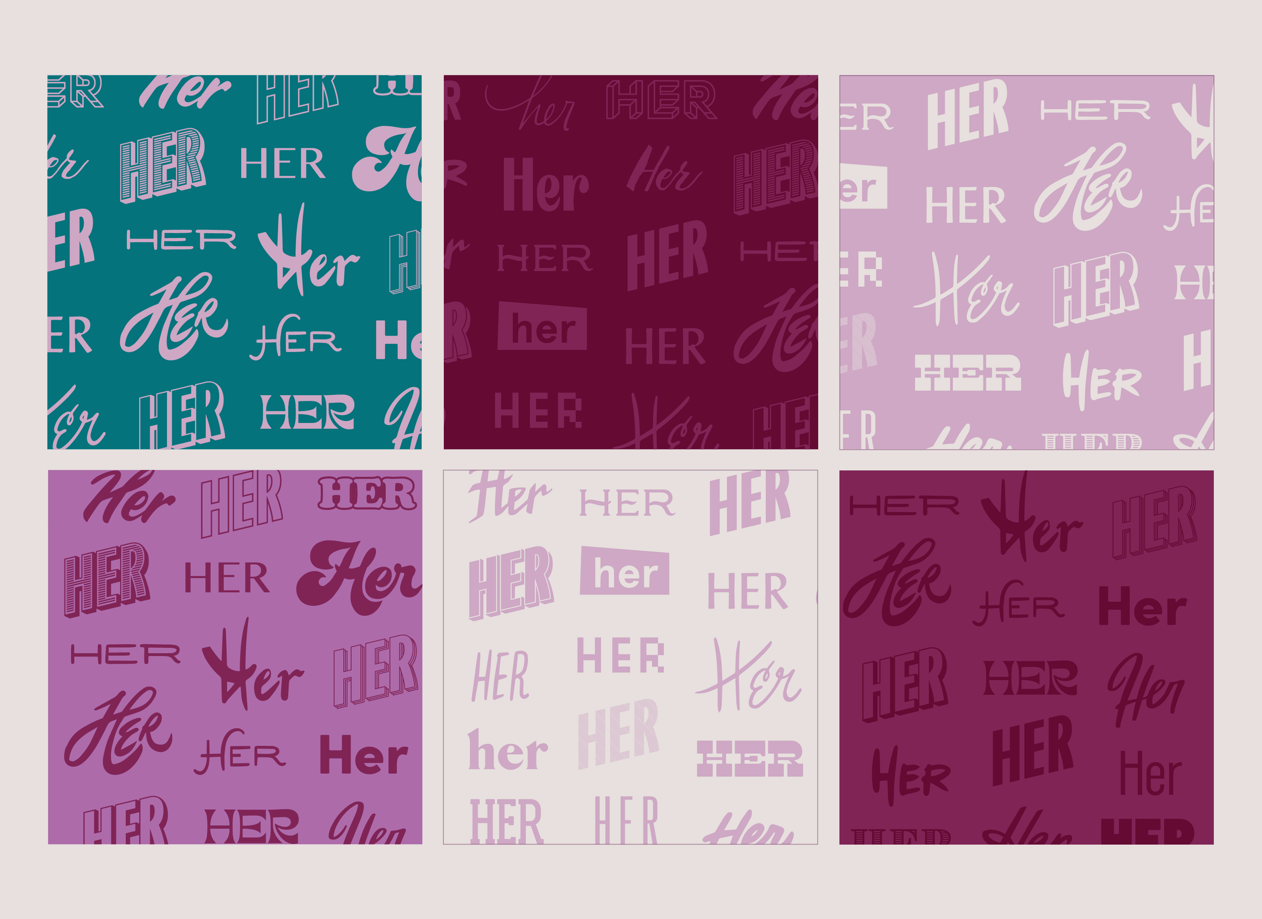
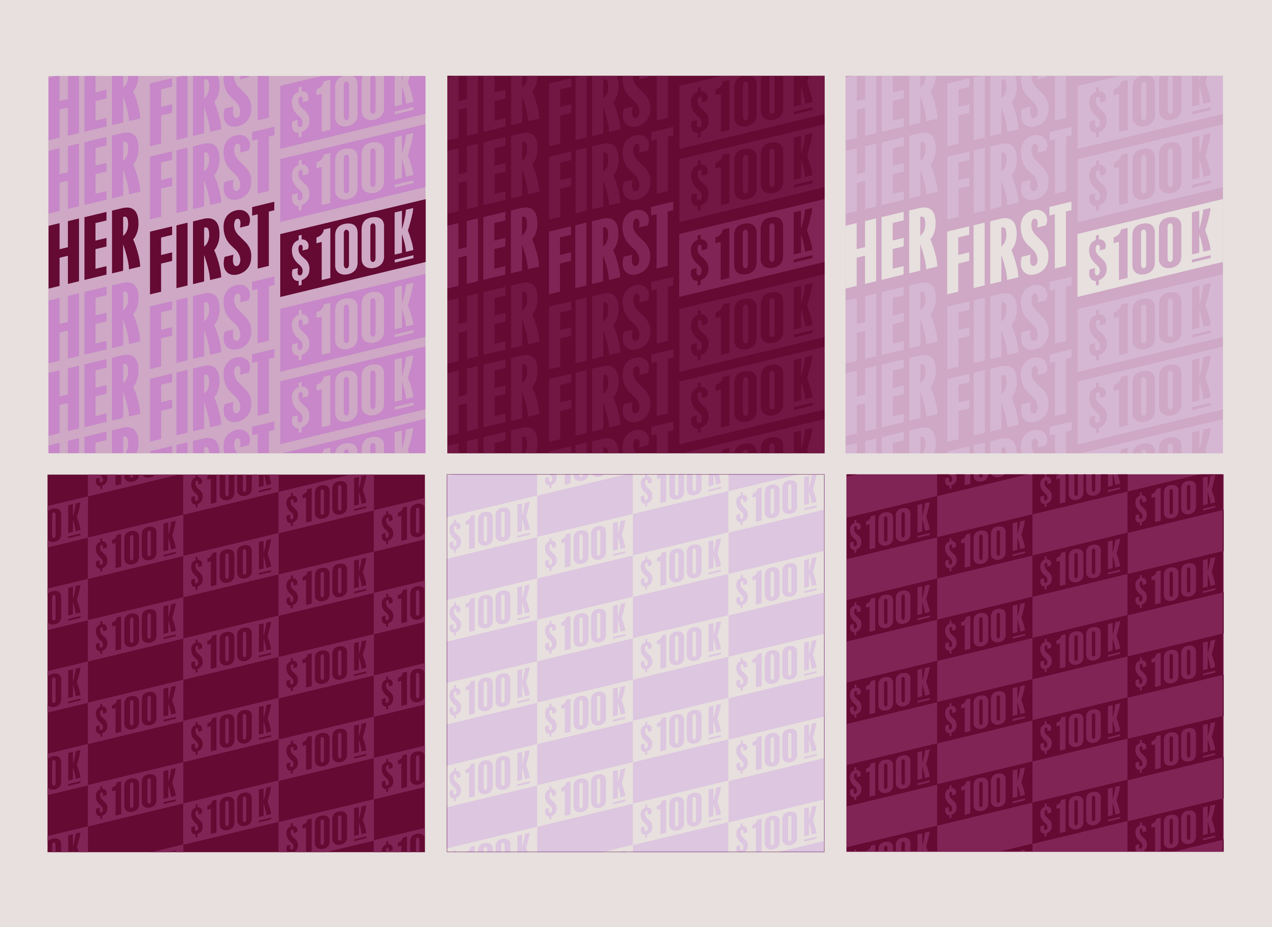

There are three brand patterns, each offered in 5-6 color ways:
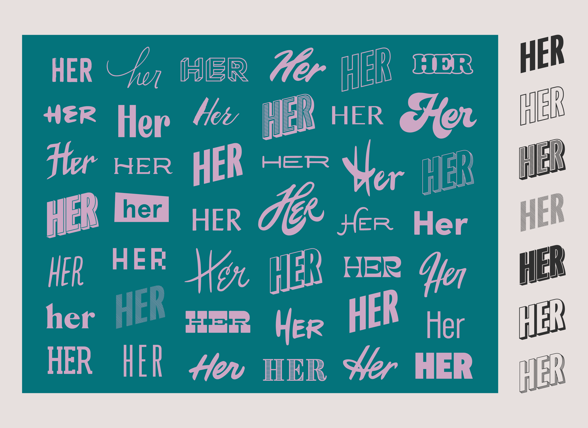
1. “Her” Pattern - made to artfully communicate that the Her First $100K Community is made up of individuals that seek financial education, each coming from unique cirumstances and “money personalities”. The pattern also includes the ‘Her’ from the Her First $100K logo, which has expanded into seven different versions.
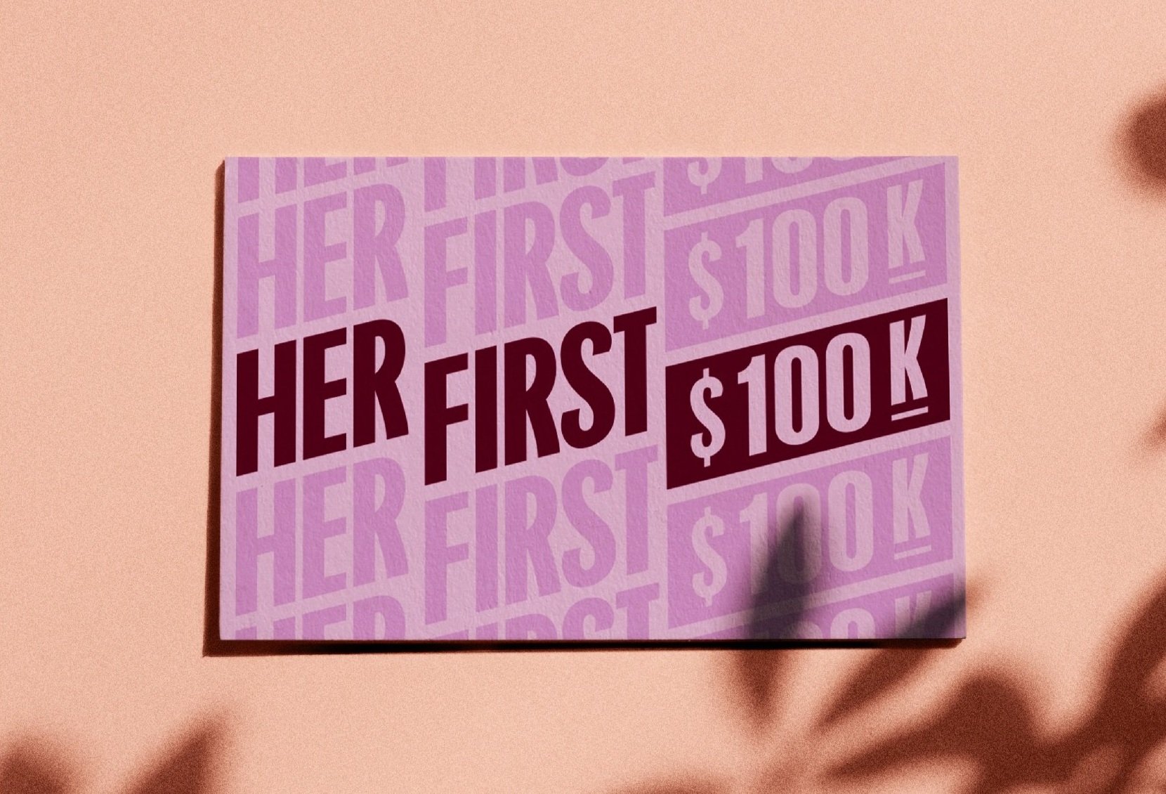
2. Logo + Bill Pattern - made from a stacked version of the Her First $100K logo.
3. Wavy Bill Pattern - a step-n-repeat of the “$100K” bill shape within the logo and warped for interest and fun.
Merchandise & Environmental Applications
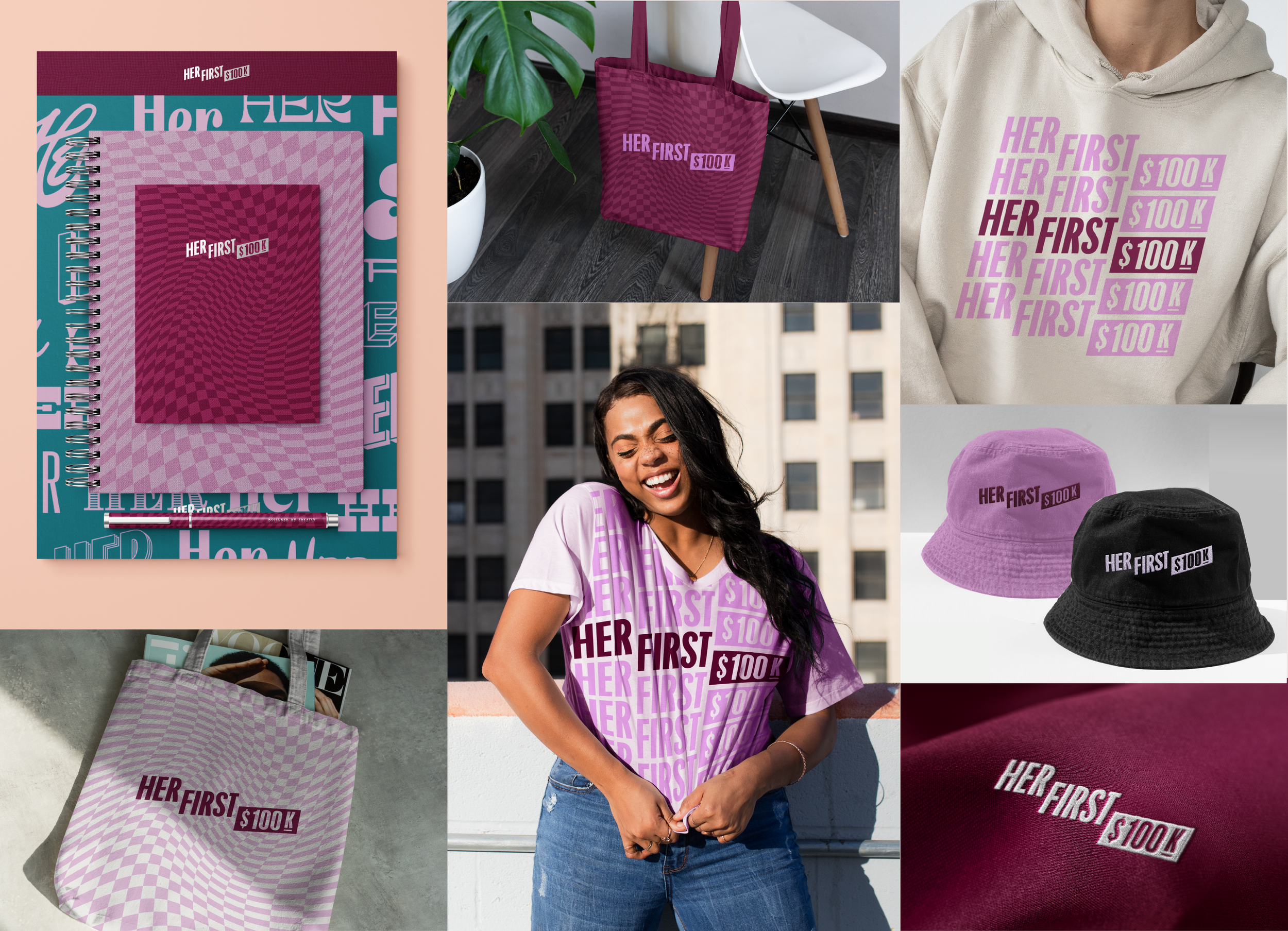
Merchandise Examples of the Her First $100K logo applied to apparel and merchandise.
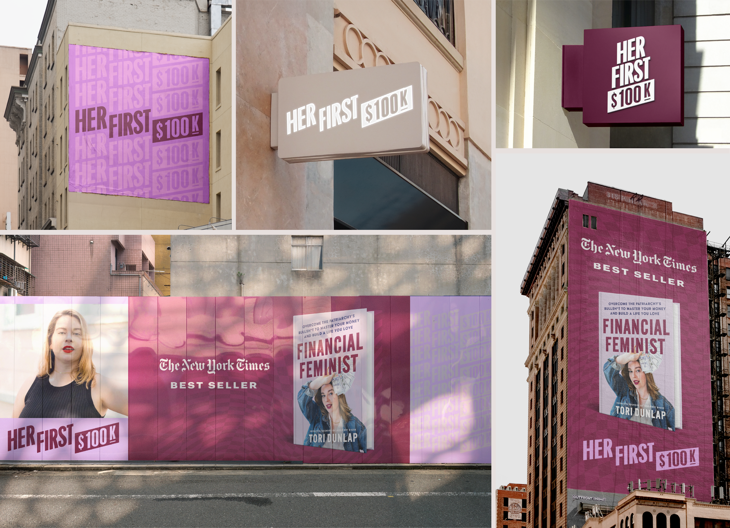
Environmental Designs - Her First $100K logo applied to signage and city advertisements.
Web & Social Applications
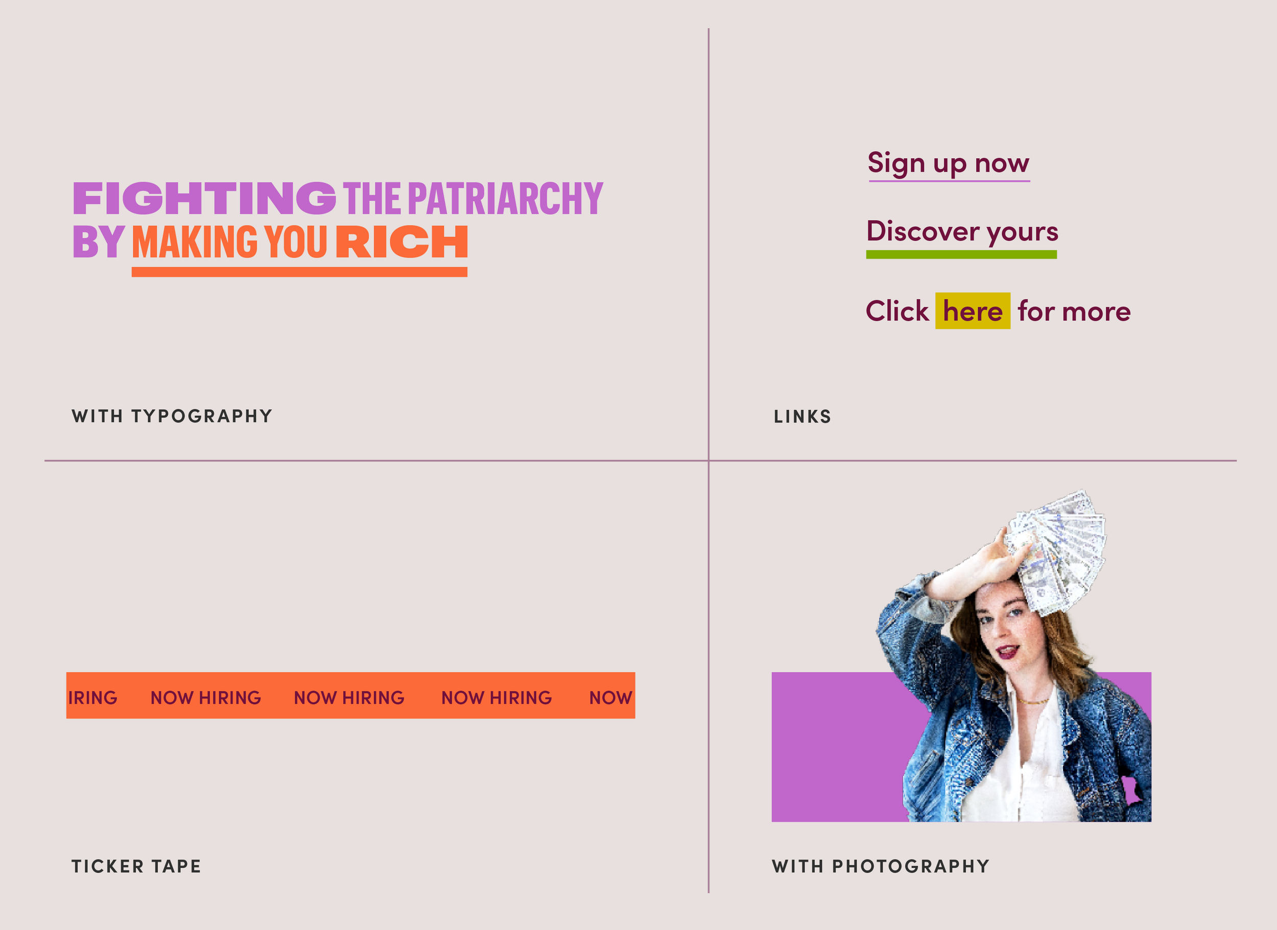
Web page and social applications made in collaboration with Geena Sisomphou.
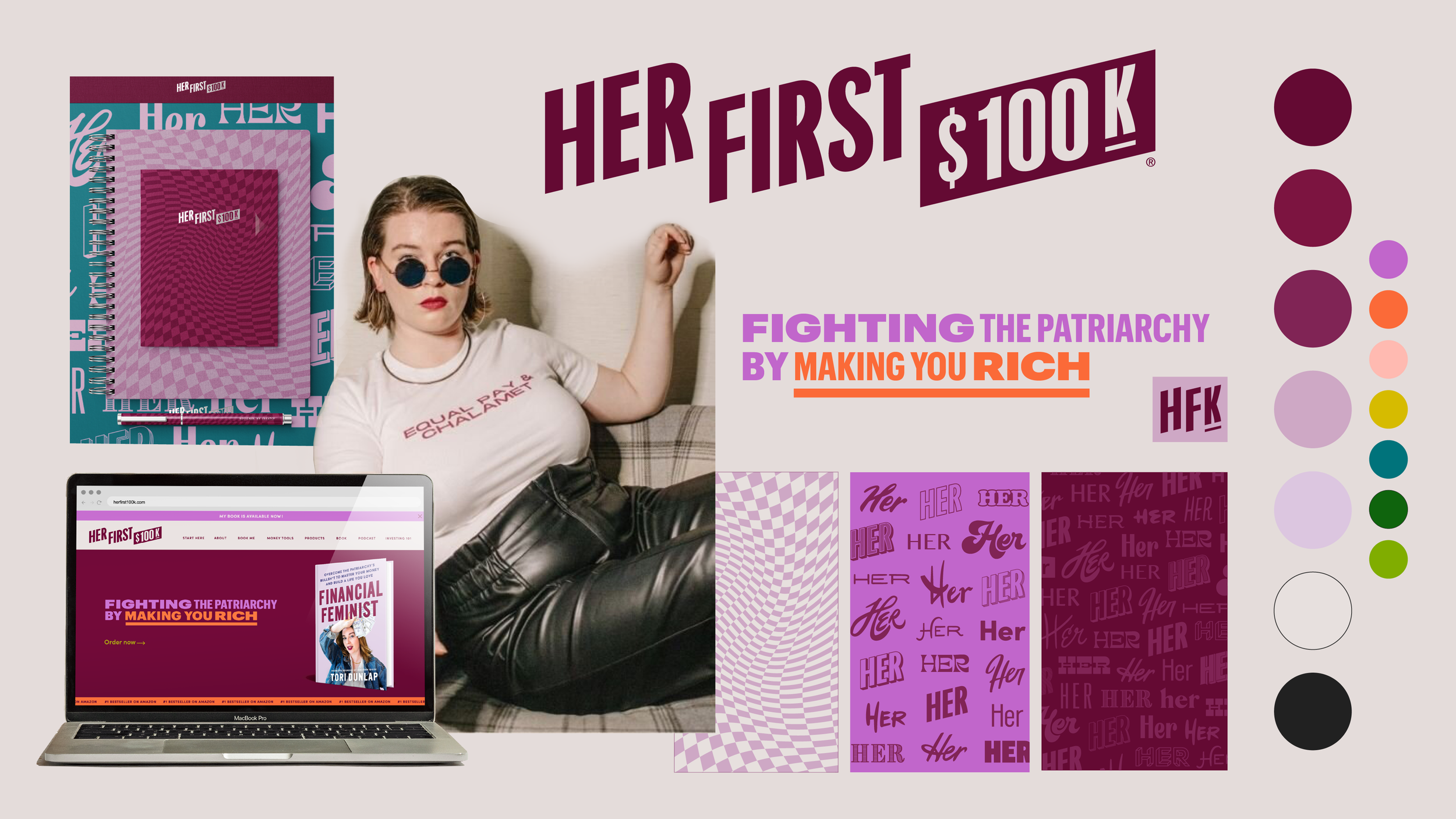
Brand overview
Big thanks to Geena Sisomphou for acting as project manager even contributing her design skills, especially to the typography and digital applications. Her collaboration took this beast of a project to another level.
